# Loupedeck vs Stream Deck: Meeting Control Guide
Loupedeck vs Stream Deck for meetings comes down to control shape, setup time, and how often your meeting work overlaps with audio, lighting, or production tasks. Stream Deck fits clean button-driven meeting actions. Loupedeck fits mixed workflows where dials, touch controls, and app profiles matter. For most meeting hosts, the better choice is the one that makes mute, camera, share, reactions, and leave call reachable without moving the active meeting window.
This guide compares both device families from a meeting-control point of view. It avoids the usual creator desk shrine tour and focuses on what happens five minutes before a call, while sharing, when someone asks, "Can you go back one slide?", and your cursor is already in the wrong zip code.
# Quick answer for meeting hosts
If your workflow is mostly discrete actions, choose Stream Deck. It gives you labeled buttons for mute, camera, screen share, recording, reactions, folders, and multi-actions. If your workflow blends meetings with audio levels, lighting, camera framing, creative apps, or live production, choose Loupedeck. Its dials and touch controls can reduce context switching when a meeting is only one part of the desk.
MuteDeck changes the decision slightly. Instead of asking which device can control one meeting app, ask which device gives you the easiest access to a consistent control layer across Zoom, Teams, Google Meet, and your daily setup.
# What the devices are built to do
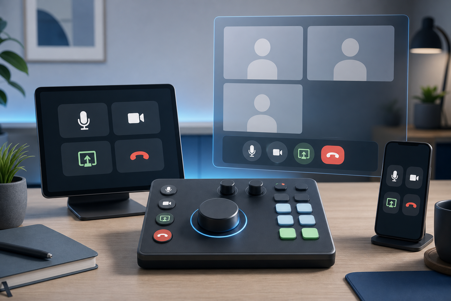
Elgato's Stream Deck line centers on customizable keys. The current Stream Deck Mk.2 (opens new window) is positioned around LCD keys, folders, multi-actions, hotkeys, plugins, and productivity controls. Elgato also advertises Zoom controls such as mute mic, camera, screen share, record, reactions, and raise hand on its product page.
The Stream Deck + (opens new window) adds dials and a touch strip, so the old shortcut comparison of "buttons versus knobs" is stale. If you compare exact models, Stream Deck can include both buttons and rotary control. The practical question is whether your meeting workflow needs those controls, not whether one brand owns the concept.
Loupedeck takes a hybrid surface approach. Loupedeck Live (opens new window) lists analog dials, tactile buttons, touch bars, touch-sensitive buttons, plugins, app profiles, and supported productivity tools. Loupedeck Live S (opens new window) also describes touch-sensitive buttons, analog dials, Zoom, Microsoft plugins, and Microsoft Teams support.
Both categories can be useful. Neither device fixes a bad meeting workflow by itself. The device only helps when the actions are mapped to the tasks that actually break concentration.
# Meeting-control decision table
| Need | Better fit | Why it matters in meetings |
|---|---|---|
| One-touch mute, camera, leave, share | Stream Deck | Dedicated labeled buttons are easy to hit under pressure. |
| Frequent volume, lighting, or camera adjustments | Loupedeck or Stream Deck + | Dials reduce repeated mouse trips for continuous controls. |
| Simple setup for a non-technical host | Stream Deck | A button grid is easier to explain and document. |
| Creative desk that also runs meetings | Loupedeck | App profiles and mixed controls fit broader production habits. |
| Many meeting apps in one week | Either with MuteDeck | The important layer is consistent meeting intent, not device branding. |
| Shared desk or hot-desk setup | Stream Deck | A plain button layout is easier for another person to understand. |
| Operator desk for webinars or training | Loupedeck | Dials, pages, and profiles help when meetings resemble live control rooms. |
The table is a starting point. The decision gets clearer when you list the moments where you lose control: muting while another app is focused, finding the share button, toggling camera before joining, raising a hand without interrupting notes, or leaving a call cleanly before the next one starts.
# Setup friction matters more than feature count
A meeting controller has to be boring at 8:58 a.m. That means the profile loads, the labels make sense, and the actions match the meeting platform you are using that day.
Stream Deck usually wins the first-week setup test for button-only meeting control. You can make one page for meetings, add actions for mute, camera, share, leave, and status, then build folders for Zoom, Teams, and Google Meet. If the user knows what each button means, the setup is already halfway done.
Loupedeck can take more planning because the surface has more control types. That extra planning can pay off when a host manages meetings and desk conditions together. A dial for monitor brightness, a page for lighting, a touch button for mute, and a profile for presentation apps can reduce the amount of hunting across windows.
Do not build the layout from the hardware outward. Start with the meeting failure modes:
- What must work while the meeting app is not focused?
- What must be visible without opening the meeting window?
- What must be reversible if you hit it by mistake?
- What actions belong on the first page because they happen every call?
- What actions belong in a folder because they happen once a week?
That list prevents the classic problem: a beautiful grid full of clever automations that still leaves the mute button in a folder during the only moment it matters.
# How MuteDeck changes the comparison
MuteDeck gives meeting controls a consistent layer across supported platforms and devices. That matters because the real friction is rarely the physical button. The friction comes from switching between Zoom, Teams, Google Meet, browser windows, slides, notes, and chat while trying to keep your presence under control.
A Stream Deck profile can use MuteDeck actions for clear meeting buttons. That pairs well with the practical setup in our guide to a mute button on keyboard (opens new window) because the same principle applies: define the action, then make it reachable from the control surface you trust.
A Loupedeck profile can use MuteDeck alongside desk controls. That fits hosts who also adjust audio, lights, scenes, or creative apps. If meetings are part of a broader production workflow, a mixed surface can keep more of the desk in one place.
The best profile is small. Put mute, camera, share, raise hand or reaction, recording, and leave call on the first page if you use them often. Put troubleshooting actions on a second page: open audio settings, open camera settings, restart meeting app, and launch your test room. The first page runs the meeting. The second page saves the meeting when software remembers it has opinions.
For background on controlling meeting state with physical devices, see MuteDeck's older guide to customizing a Stream Deck for working from home (opens new window) and the product notes around new Teams API support, Stream Deck, Loupedeck, and Touch Portal actions (opens new window).
# A concrete scenario: weekly customer demo
Picture a product lead running a weekly customer demo. The call starts in Zoom, the deck is in Keynote or PowerPoint, notes are in a browser, and the chat window keeps stealing attention.
A Stream Deck layout might use eight meeting buttons: mute, camera, share, stop share, record, raise hand or reaction, paste demo link, and leave call. The second row could open the agenda, launch the demo environment, start Do Not Disturb, and reset audio input. The benefit is clarity. Every critical action has a label and a known location.
A Loupedeck layout might put mute and camera on touch buttons, output volume on a dial, key light brightness on another dial, slide navigation on tactile buttons, and meeting tools on a Zoom or Teams page. The benefit is range. The operator can control the call and the room without building every action as a square button.
The right choice depends on who uses the desk. A solo operator can memorize pages and dials. A rotating host team needs obvious labels, fewer layers, and a printed runbook. Hardware that fits the person using it will beat hardware that looks more capable on paper.
# Non-obvious implementation tip: separate intent from app commands
Do not label your core controls around app-specific mechanics. Label them around intent.
Use names like "Mute me," "Camera off," "Share screen," "Stop sharing," "Record," and "Leave." Under the hood, those actions can route through MuteDeck, app plugins, keyboard shortcuts, or platform-specific APIs. The label should describe the host's goal, not the plumbing.
This matters when you move between platforms. Zoom, Teams, and Google Meet place controls in different areas and use different shortcut behavior. If the first page of your device always represents the same meeting intentions, the host does less translation during the call.
Also build a verification button or habit. Before important calls, press mute and camera once in a test room, watch the meeting app state, then return to the desired join state. Physical controls are only reliable when the feedback loop is visible. A silent failed shortcut is worse than no shortcut because it creates confidence with no evidence.
# When to choose Stream Deck
Choose Stream Deck when your main need is fast, labeled meeting actions. It is a good fit for managers, consultants, support leads, trainers, and presenters who want fewer mouse trips without designing a full production console.
It also fits teams that need a repeatable setup. A shared profile can document the first page, use common labels, and keep risky actions away from casual users. If someone else has to run your meeting while you troubleshoot, a grid of obvious buttons gives them a fighting chance.
Stream Deck + deserves a separate look if you want dials but still prefer the Stream Deck ecosystem. The presence of dials means you should compare it against Loupedeck on workflow and software fit, not on a broad assumption about hardware controls.
# When to choose Loupedeck
Choose Loupedeck when meetings overlap with production, creative tools, audio, camera scenes, lighting, or complex desk states. The hybrid surface helps when continuous adjustments matter as much as one-touch commands.
It can also suit hosts who already think in profiles. If your day moves from Teams to editing to live training to Zoom, app-specific pages can feel natural. The cost is setup discipline. More controls create more places to hide the one action you need during a mildly cursed live call.
For a meeting-first workflow, keep the default meeting profile restrained. Use dials where they solve real continuous-control problems. Use buttons for decisions that should be binary: muted or unmuted, camera on or off, sharing or not sharing.
# Final recommendation
For most meeting hosts comparing Loupedeck vs Stream Deck, start with Stream Deck if your goal is dependable one-touch meeting control. Choose Loupedeck if your meetings share space with audio, lighting, camera, or creative workflows where dials and app profiles earn their place.
Whichever device you choose, build the profile around meeting intent. Keep the first page small, test it in the actual app, and use MuteDeck when you need one control model across Zoom, Teams, Google Meet, and your desk hardware. The winning setup is the one you can use while presenting, answering a question, and pretending the notification preview never happened.